Landing Pages for Financial Services

Landing pages for financial services are an efficient and effective way of providing value to visitors in exchange for their information. Once integrated with other digital marketing strategies, they give you the ability to increase conversion rates and funnel efficiency.
Best Practices: Landing Pages for Financial Services
Read on to get some best practice tips to optimize your landing pages so that they convert at a higher rate compared to the financial services industry average of five percent [1]:
Understand Your Visitor’s Frame of Mind.
By creating landing pages for financial services, you want meaningful conversions – not high bounce rates. This can only be done when you speak directly to your visitors, without judgement, but with an understanding and purpose.
Think from the perspective of your potential clients: what do they want? What are they feeling? If you were in their shoes, what would you be seeking? What would prompt you to take an action? Likewise, what would not?
Let’s do a fun little exercise to get the gist of this point.
Take a few moments to read through the following example:
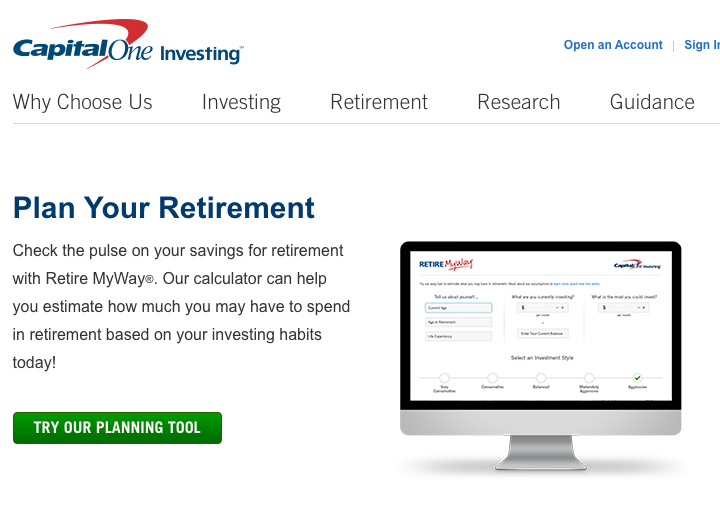
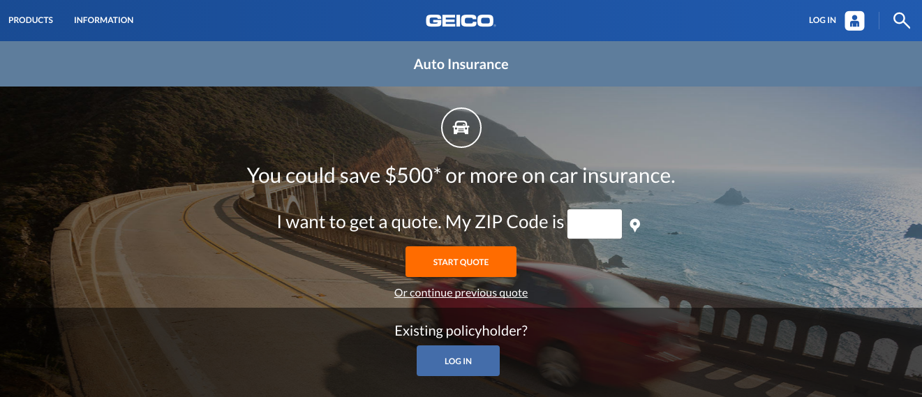
It’s a fairly decent landing page, right? It’s simple and straightforward. It does a good job making the process look easy with the image of what the tool actually looks like, and even has a bright green call-to-action button.
Not bad.
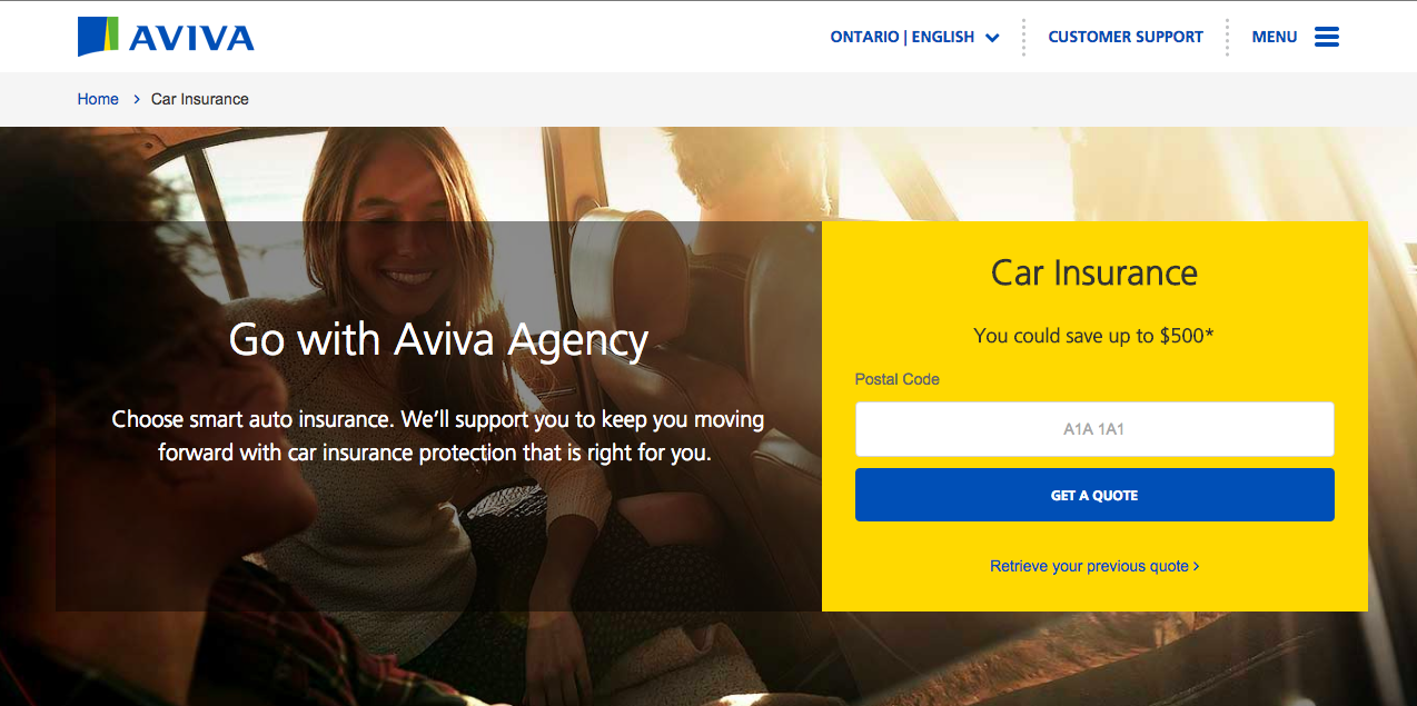
But now look at this one:
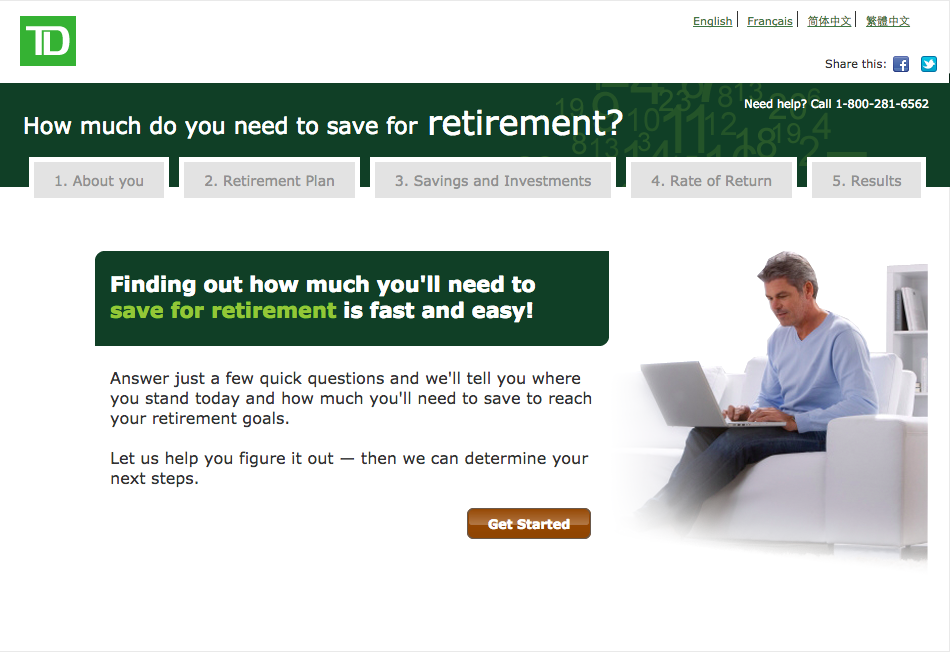
Regardless of the same retirement planning theme, what makes this page different? (What makes it better?)
For one thing, the image on the right serves a more important purpose than that of the previous one. It should come as no surprise that mature adults dominate the retirement market’s customers. A 2014 PwC study reports that aging baby boomers are growing anxious about their financial welfare and are actively seeking advice [2].
As a financial services marketer, your goal should be to meet them halfway. By putting yourself in their shoes, you can make an effort to reduce their stress and try to support them. This is what makes this page more effective than the previous one. TD’s emphasis on “help”, with “helping you figure it out” in the message, and the “need help?” call extension, utilizes an opportunity to build a client satisfaction model.
Remember, because online services take away the real face-to-face interactions with customers, managing the customer service experience is that much more important when it comes to building your brand in the digital space.
In short, this landing page does everything that the first one does, but more importantly, it speaks directly to potential clients in a manner that resonates.
Incorporate Social Proof.
Becoming a client to a financial service provider is a lengthy and high-involvement process; it requires rational problem solving to make the buying decision, and undertaking substantial financial risk [3]. And when you add awareness of increasing financial crimes and fraudulent activities into the mix, it isn’t surprising when potential leads become less trusting of online financial services marketing. It’s a natural psychological response.
This is where social proof come into the picture.
In addition to providing visible trust certificates on your webpages, client endorsements, testimonials, and media logos, you can make landing pages for financial services more credible in the eyes of a potential lead. Use quotes and testimonials to communicate an effective endorsement.
Consider this example that was found at the bottom of a landing page:
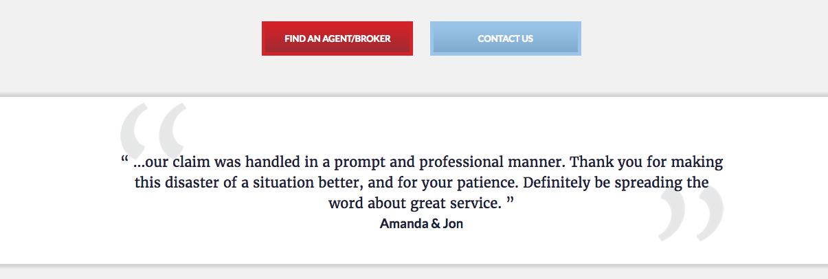
Convincing, isn’t it?
Another point to note is that trust and credibility can also be nurtured by providing a high quality experience through appealing graphics. Research shows that visitors react negatively to dull and boring images such as stock photographs, and poor quality images of any kind [4]. As graphics are just as likely to reduce readership, as they are to increase it, here is an example of what you should avoid:
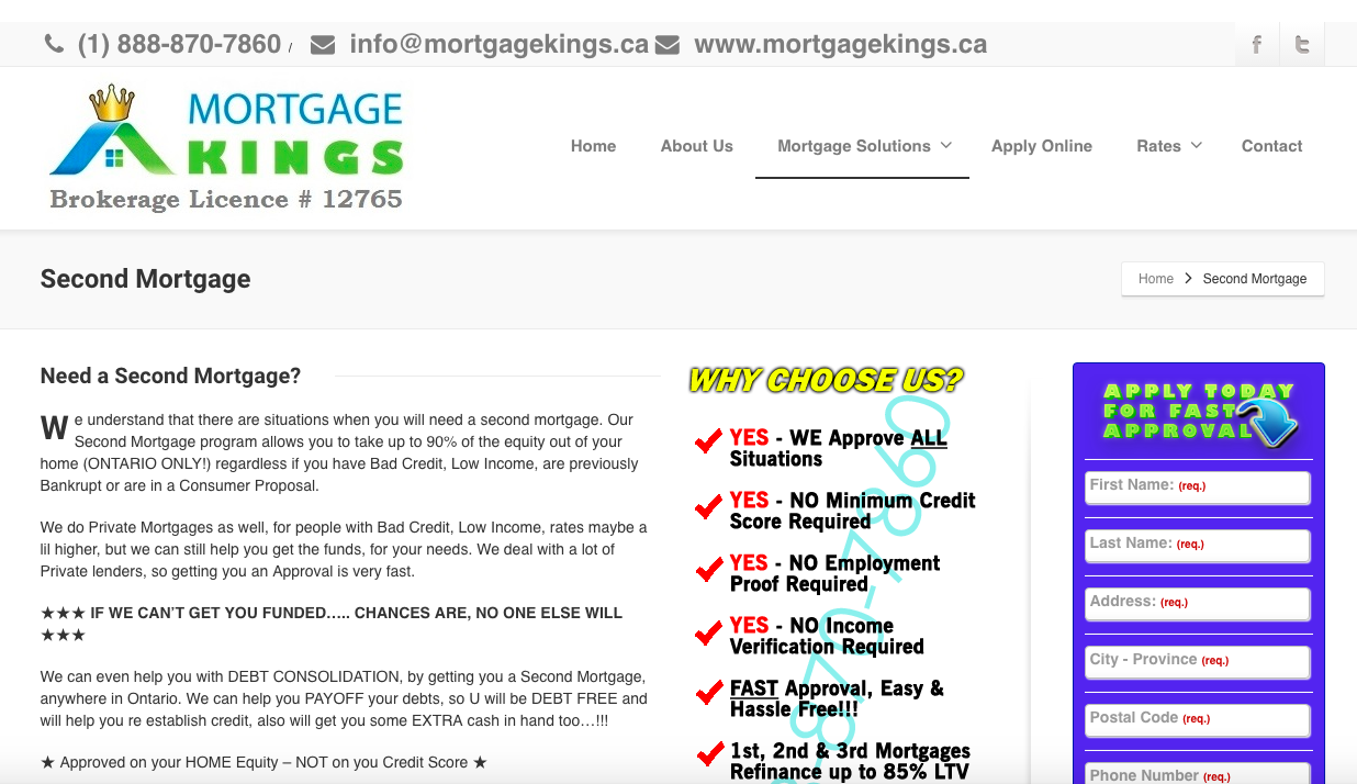
As a marketer, your goal should be to make your landing page look more credible and appealing. This one does neither.
The “why choose us?” image with its watermark and fluorescent colours, inconsistent fonts and colour scheme, poorly written descriptions, and general lack of appeal will definitely hinder visitor conversions.
Explain your Price Positioning.
Consumers do online research and price comparisons, especially when the product or service belongs to a high involvement category such as those in financial services. These customers will trust you with their income and life savings; it’s only fair that you give them the best value-for-money.
You could use a more direct approach like this:
Or you could not only market to price sensitive customers, but also justify why you offer the best value:
See the difference?
By using your landing page as an effective sales tool, like Aviva does, you can convince your visitors of your distinct value proposition and prompt them to act in the interest.
And remember, just because your landing pages for financial services don’t involve a “price”, it doesn’t mean that this point does not apply. In this context, price has more to do with value-proposition than it does with numbers and figures.
And lastly, simplicity and clarity drive higher conversions.
This tip encapsulates everything we have discussed and more. This is an opportunity for you to use your newly acquired knowledge and analyze the following landing page examples:
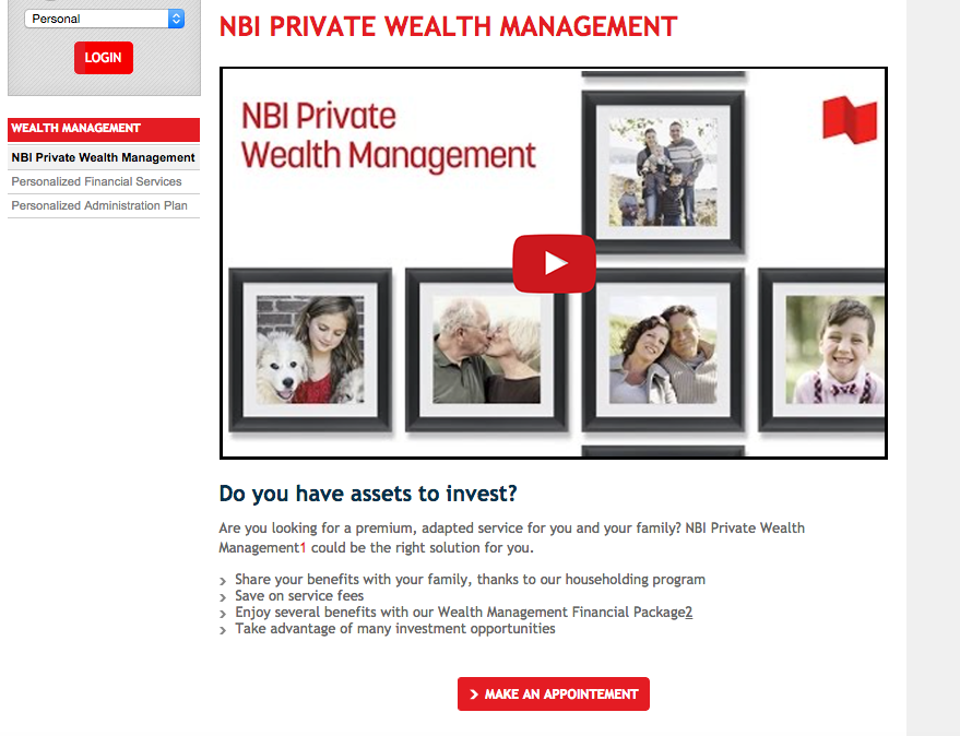
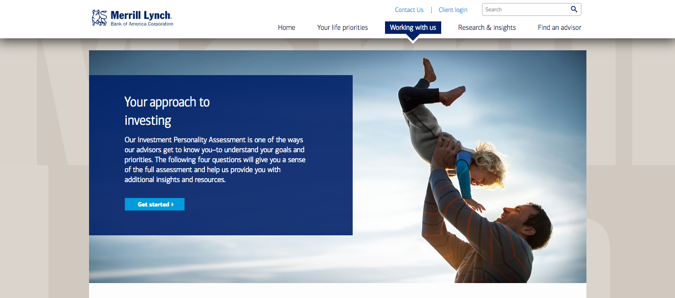
These give us a lot to talk about. Lets compare and contrast:
- In terms of webpage heuristics and overall quality, the second example is significantly better. For NBI, a visitor has to scroll down to see the actual message and call-to-action button due to the page fold. As this is something that can easily be overlooked by a visitor, it can negatively impact conversion rates [5]. (Winner: Merrill Lynch).
- Though both pages provide images that make an intuitive connection to the purpose of the page, NBI goes the extra mile with an embedded video. According to research conducted by Unbounce, an embedded video on a page can increase conversion lift by 69 percent [6]. (Winner: NBI).
- There are no client experience management efforts made on either of the pages. (No Winner)
- No social proof either. (No Winner).
- Both examples offer unique value propositions. (Winner: NBI & Merrill Lynch)
If you add up the scores, you’ll find that it’s a tie: both of these landing pages are equally mediocre and not fully optimized – an insight that holds true for many financial services.
But don’t be discouraged; there are a few good ones out there. For reference, here’s RBC’s fully optimized wealth management landing page:
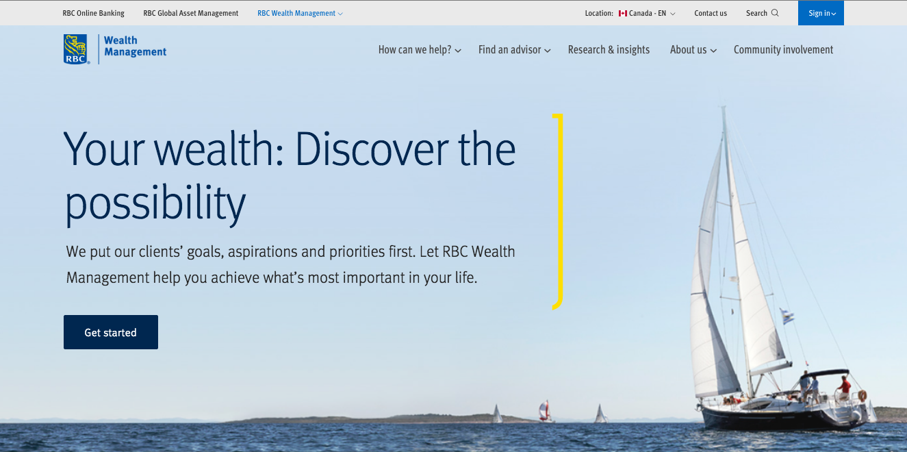
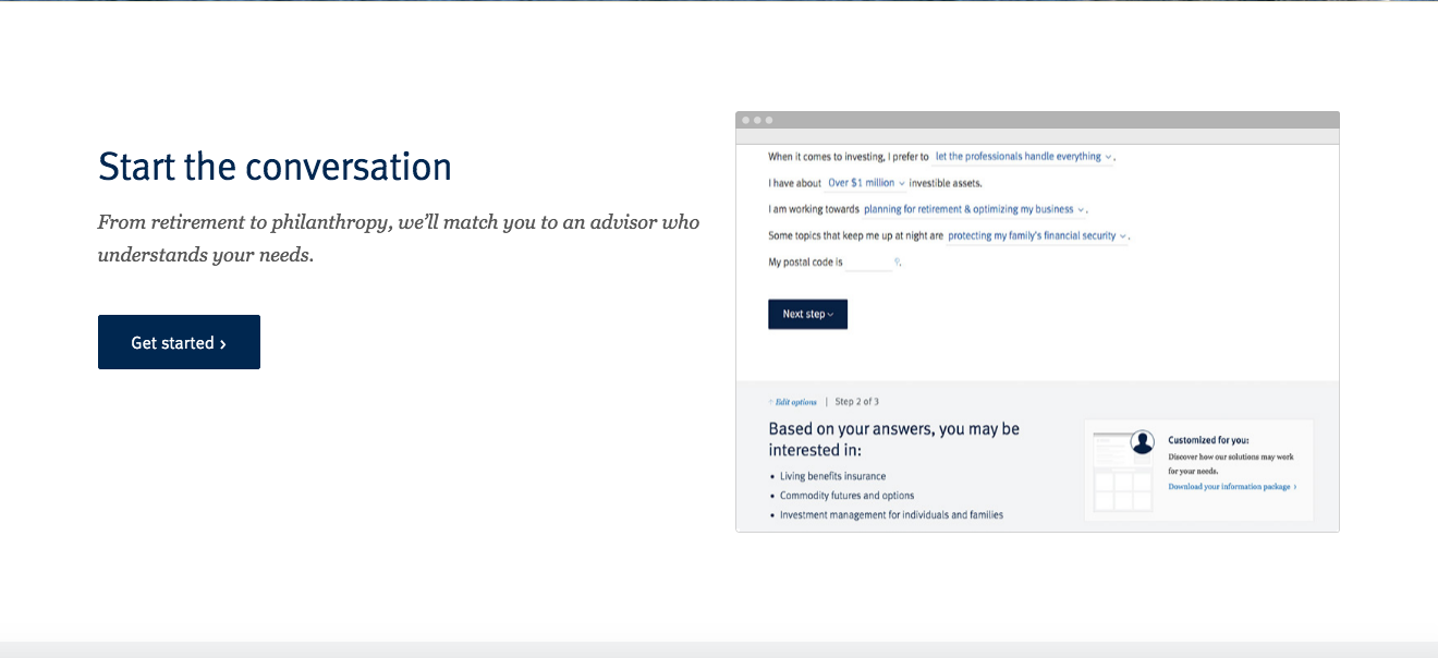
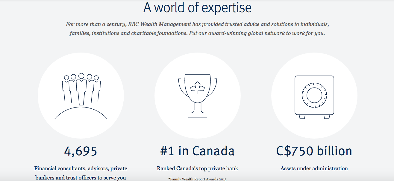
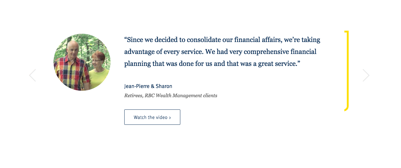
As opposed to the previous examples, notice how this page checks all the right boxes?
- Message is effectively communicated to potential client.
- Help and other assistance provided at the top.
- Social proof is provided in the form of a ranking ad client endorsements.
- Page is used as a highly convincing sales tool.
- Webpage design is clean and simple.
- Scrolling down the page is an intuitive action.
This is what it means to offer a high quality experience to a visitor through a landing page.
Now’s your turn to challenge yourself by utilizing these different optimization practices and increasing conversion rates.
Good luck.
Sources:
[1] – Search Engine Land
[2] – PwC’s Sound Advice
[3] – AdCracker
[4] – Kissmetrics Blog
[5] – Wishpond Blog
[6] – Unbounce Blog